Monday, October 29, 2012

INFLUENCE OF STYLE


All of us as artist have heroes we look up to.  other artis whose works inspires us to be better and we allow to influence the procese of our own work.  today i would like to share two of mine with you.

First we have David Finch.  a killer comic book penciler and inker out of canada.  i love his compositions, dramatic and strong.  His penciling is just magnificent.  from the large blocks of value to the small tick like strokes that render delicate formes.

Here are a few of my own inspired byt he david finch style.


Another artis that is my heros and i hope to aspire to one day is Dinato Giancola


Y a i don't quite have anything to this magnitude yet, but some day i hope to.  here is what i have got.


PERSPECTIVE

It all depends on you point of view.

the basics about perspective: there are some basics one must understand in order to understand perspective.  first, some vocabulary.

Horizon: a horizontal line indicating where the ground meets the sky in a composition.  it also refers to the views line of sight when view a picture

Vanishing point: the point to wich all parallel lines converge with in a composition. there can one or several within a composition.  

Three basic types of perspective.

Single point perspective:  One-point perspective exists when the painting plate (also known as the picture plane) is parallel to two axes of a rectilinear (or Cartesian) scene – a scene which is composed entirely of linear elements that intersect only at right angles. If one axis is parallel with the picture plane, then all elements are either parallel to the painting plate (either horizontally or vertically) or perpendicular to it. All elements that are parallel to the painting plate are drawn as parallel lines. All elements that are perpendicular to the painting plate converge at a single point (a vanishing point) on the horizon.

Two point perspective: Two-point perspective can be used to draw the same objects as one-point perspective, rotated: looking at the corner of a house, or looking at two forked roads shrink into the distance, for example. One point represents one set of parallel lines, the other point represents the other. Looking at a house from the corner, one wall would recede towards one vanishing point, the other wall would recede towards the opposite vanishing point.


Three point perspective: Three-point perspective is usually used for buildings seen from above (or below). In addition to the two vanishing points from before, one for each wall, there is now one for how those walls recede into the ground. This third vanishing point will be below the ground. Looking up at a tall building is another common example of the third vanishing point. This time the third vanishing point is high in space.

Wednesday, October 10, 2012

Exaggeration and Caricature

EXAGGERATION: is the enlarging or altering beyond normal or due proportions. to ignore the natural restrictions of bones, muscles, and normal structural concerns.

DISTORTION: to change or alter the form of an object from it natural state. Making it longer or shorter, wider or skinnier, while still maintaining it integrity.

An example of both of these techniques in are are the art of caricature.  lets look at a couple of well know caricature artist and see how the have implemented, exaggeration and distortion to create, funny, whimsical, and sometime satirical works of art.

Cort Jones.


Here Mr. jones take a Naturally distinguished feature of, Jay Leno's, famously big chin. Buy exaggerating the size of the chin, along with distorting it natural structure, to be more protruding, Mr.. Jones has captured the comidic personalty of, Mr. Leno.

Jason Seiler


Seiler exaggerated the size of rollingstones front man McJagger's lips, and distorts there natural structure to be more full and round to add emphasis.


Thomas Fluharty


Here Mr, Fluharty has done the same with hilary Clinton's hair, and the size and space relation of Bill Clinton's nose and mouth.

Sunday, September 30, 2012

Principles of Design (part 1)

1.) Unity


     unity, or what can also be thought of as harmony is the presence of congruence, beyond mere chance in the composition of a pice of art. unity can be achieved in a verity of ways. most commonly unity is achieve through repetition.  The repetition of shape, value, line, color ect. Unity can also be achieved thought proximity or placement of object. object place closed together or overlapping have a sense of unity, while object that are distint from one another have disunity.  here are a ver images to help illustrate the principle of illusion

Here we have unity through repetition of shape.  even thought there are a variety of colors, unity is created through repetition of the circular shape.

This image represents unity through the repetition of the color green, even though there are differing shapes.

Here we have unity created in the lower right corner through proximity/ grouping. the circle in the top left feels out of place do to it placement far away from the rest of the circles. 

Emphasis:

The attract of a viewers attention to the intended ares of an object.  Emphasis can be created in a number of ways: Contrast, Isolation, and placement. there also can be a hierarchy of emphasis with one object having the major emphasis and other objects with varying degrees of emphasis.

Emphasis through value:  the ; light value circle gets more attention then the dark value circles.


emphasis through isolation

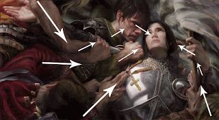
(joan of arc, Donato Giancola)
emphasis through placement:  the women's face gets the emphasis in this picture due to it placement. the arrows are to show that the face is placed and that all other lines and shapes flow to the face creating emphasis.


Scale/Proportion: 

Scale/Proportion refers to relative size- size measured against other element or some mental norm or standard. scale can also refere to the physical proportion of the art created.

here we see the use of a large scale to create a piece of intreats.  we know that in comparison people are not naturally larger then cars, so the large scale of the painted running human, compared to the real cars makes tis work stand out.
here we see scale used to create intrest.  the central and largest figure dominated the other smaller figures in the painting, making it the focal point of the composition.  the scale of the figures is in relation to there importance.  All are adult figures but have different levels of importance.  the donors are least significant, followed by the two saint, and finally the largest saint in the midel is most important, thus all are sized accordingly. 


Sunday, September 23, 2012

Anthropomorphism and Metamorphism

Anthropomorphism: the giving of human like qualities or atributes to inanimate objects or animals.

The use of anthropomorphism in art is a way one can express an abstract or fantastic idea. consider these examples and hoe the anthropomorphized figures lend to the mood of the story.


Metamorphis: the physical change of an objects state to another physical state.